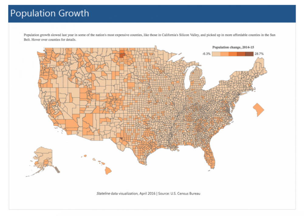
In The Washington Post, Christopher Ingraham highlights an interesting example of how data visualisation can be misleading when colours schemes are used inappropriately. Taking data on US population change 2014-2015, he contrasts how Pew represented the data with his own version.
 Pew's Visualisation of the Data
As Ingraham notes, mapmakers normally rely on a bivariate colour scale to indicate big distinctions so one set of colour shades are used to represent positive values and a separate set are used for negative values. In his visualisation of the Pew data, big distinctions are clearly represented by using blue for positive and red for negative.
Using colour, Ingraham's map clear shows where the population is growing and where it is in decline. The same information is difficult to discern from the Pew map because "the entire map gets washed out into two similar colours".
Ingraham's Visualisation of the Data
Ingraham uses the example to point out that while numbers have a veneer of authority, "communicating with numbers is, in many ways, just like communicating with words. You make decisions about what to emphasize and what to downplay, and about how to convey a full understanding of the subject at hand."
Data Mapping Tools
Colorbrewer can be used to suggest appropriate colour schemes taking into account different kinds of data (sequential, diverging, qualitative)
Fusion Tables support visual and interactive representations of data. For geographical information, they can be used to plot locations and routes. The following example from Google News Lab shows how The Guardian’s Simon Rogers used Google Fusion Tables to create an interactive map of homeless rates in England.
BatchGeo is another mapping tool to create maps from Excel and other spreadsheets. BatchGeo is free for data sets of less that a thousand rows. The example below shows a map of the world's tallest buildings created by using open web data from Wikipedia.
CartoDB is a mapping tool with additional levels of functionality. Using SQL, users can query the data and create different views. In the example below, Brian Kilmartin has used CartoBD to map the worldwide offices of Mossack Fonseca; the company at the centre of the Panama Papers scandal.
Tableau also has useful mapping options. In the following example, Andy Kirk has used the WikiLeaks data to analyse and track causalities in the Afghan War.
Interested in Data Journalism? Register for FuJo's Getting Started With Data Journalism Course in May.
Subscribe to FuJo's Monthly Newsletter.


