In 1982, a Princeton statistician Edward Tufte remortaged his house to self-publish a book on information design. The Visual Display of Quantitative Information went on to become the pioneering and definitive text on data visualisation and Tufte’s ideas have considerable import for digital media publishers.
Infographics and interactive data visualisations are very effective tools for conveying complex information. There are also visually appealing, highly shareable and support sustained audience engagement; three characteristics much sought after by online publishers. Unsurprisingly, legacy news media are particularly keen to exploit the popularity of data visualisation. The Guardian, most notably, now produces data graphics on everything from language diversity in the UK to the Iraq War Logs.
With the growth of free and easy-to-use online visualisation tools like Visual.ly, the art of representing data is not limited to well-resourced newsrooms. Unfortunately, such tools have littered the internet with “chart junk”; Tufte’s term for unnecessary visual flourishes that distract the viewer from true information. For example, in the graphic below, the columns, arrow and colour grading are merely decorations for emphasis; they don’t add to the written statement and they don't follow Tufte's golden rule: "show the data".
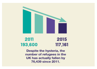 Source: WTF Visualisations
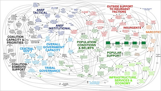
Given the popularity of data visualisation, it is perhaps unsurprising that data graphics are often used rhetorically to give an appearance of in-depth analysis. In Iraq for Sale (2006), the low-budget filmmaker Robert Greenwald purports to show the corrupt corporate connections between US senators and military contractors. As he zooms quickly across a chart of criss-crossing lines and labels that escalate into a blurry mess, it's difficult to identify anything of information value. This junk chart doesn't aim to say anything about actual corruption; it just translates the sentiment "the whole system is corrupt" into a diagram.
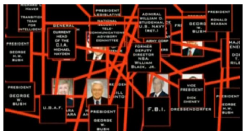 Source: Iraq for Sale (2006 Greenwald)
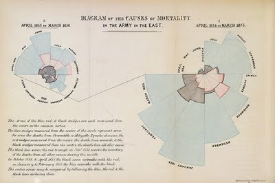
Good data visualisation is not incompatible with rhetorical persuasion. As part of her effort to persuade British authorities to improve sanitary conditions in military hospitals, Florence Nightingale pioneered applied statistics and developed novel designs like the coxcomb. In the coxcomb chart below, the area of each region shows the number of soldiers who died of wounds (red), preventative diseases (grey), or other causes (black) during each month of the Crimean War. Nightingale's graphics also adhere to Tufte's ideas about the "data-ink ratio". Almost all aspects of the presentation (ink) are linked to information (data). A high data-ink ratio eliminates chart junk.
Misguided visualisation is not limited to amateurs dabbling with online tools. The US military’s predilection for MS Powerpoint reached a zenith of absurdity with the infamously nonsensical “Afghanistan Stability/COIN Dynamics” slide.
Ironically, Tufte compares ‘the cognitive style of Powerpoint’ to Stalinist propaganda in which “orderly followers” feign attention while the Stalinst speaker commands: “Next slide, please”. Although some deem his stance unfair, Tufte believes Powerpoint is an enemy of understanding because the template imposes a rigid hierarchy on information presentation via the bullet point list and "impoverished space leads to over-generalizations, imprecise statements, slogans, lightweight evidence, abrupt and thinly argued claims".
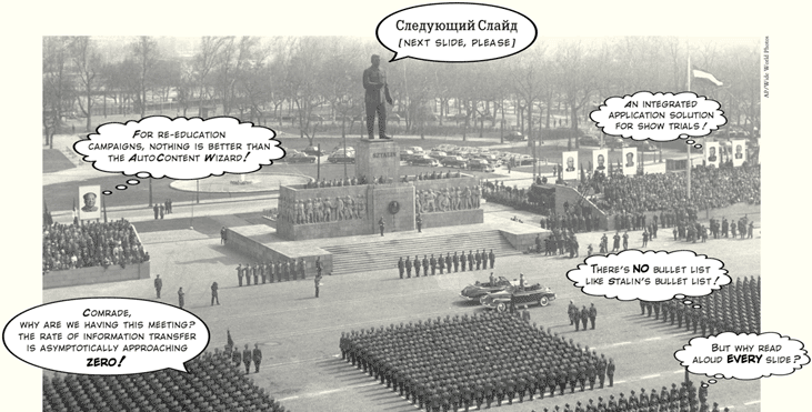 Edward Tufte (2003) 'The Cognitive Style of Powerpoint"
The Art of Analytical Design
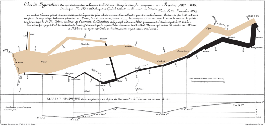
Despite technological changes, Tufte argues that new tools don’t alter the principles of good visualisation and they can’t remedy a poor understanding of information. In fact, one of the most frequently cited examples of great data visualisation comes from the age of pen and paper: Charles Joseph Minard’s representation of Napoleon’s 1812 Russian Campaign.
Minard depicts the march and retreat of the French army across six data dimensions: latitude, longitude, direction of movement, time, temperature, and size of the army. Tufte describes this work as "the greatest statistical graphic ever drawn" in which graphical elegance is “found in simplicity of design and complexity of data.”
To find “excellence” in data graphics, Tufte’s references an eclectic range of visual works. His 1990 book 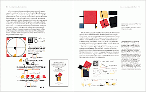 Envisioning Information discusses astronomical drawings from the 1600s, law school enrollment records, advertising posters and modern art. This interest in art is carried over into his work as a sculptor and his development of a "234-acre tree and sculpture farm". While drawing inspiration from diverse artistic sources, in Beautiful Evidence (2006) Tufte explains that principles of analytical design “are derived from the principles of analytical thinking.” As such, they are universal and “not tied to any particular language, culture, style, century, gender, or technology of information display.”
His six fundamental principles of analytical design are
1) Show comparisons, contrasts, differences.
2) Show causality, mechanism, explanation, systematic structure.
3) Show multivariate data; that is, show more than 1 or 2 variables.
4) Completely integrate words, numbers, images, diagrams.
5) Thoroughly describe the evidence. Provide a detailed title, indicate the authors and sponsors, document the data sources, show complete measurement scales, point out relevant issues.
6) Analytical presentations ultimately stand or fall depending on the quality, relevance, and integrity of their content.
Cover Image Source: Centralasian Flickr
